I set out to create a mark that could be used on its own while also devising the company’s new brand
guidelines.
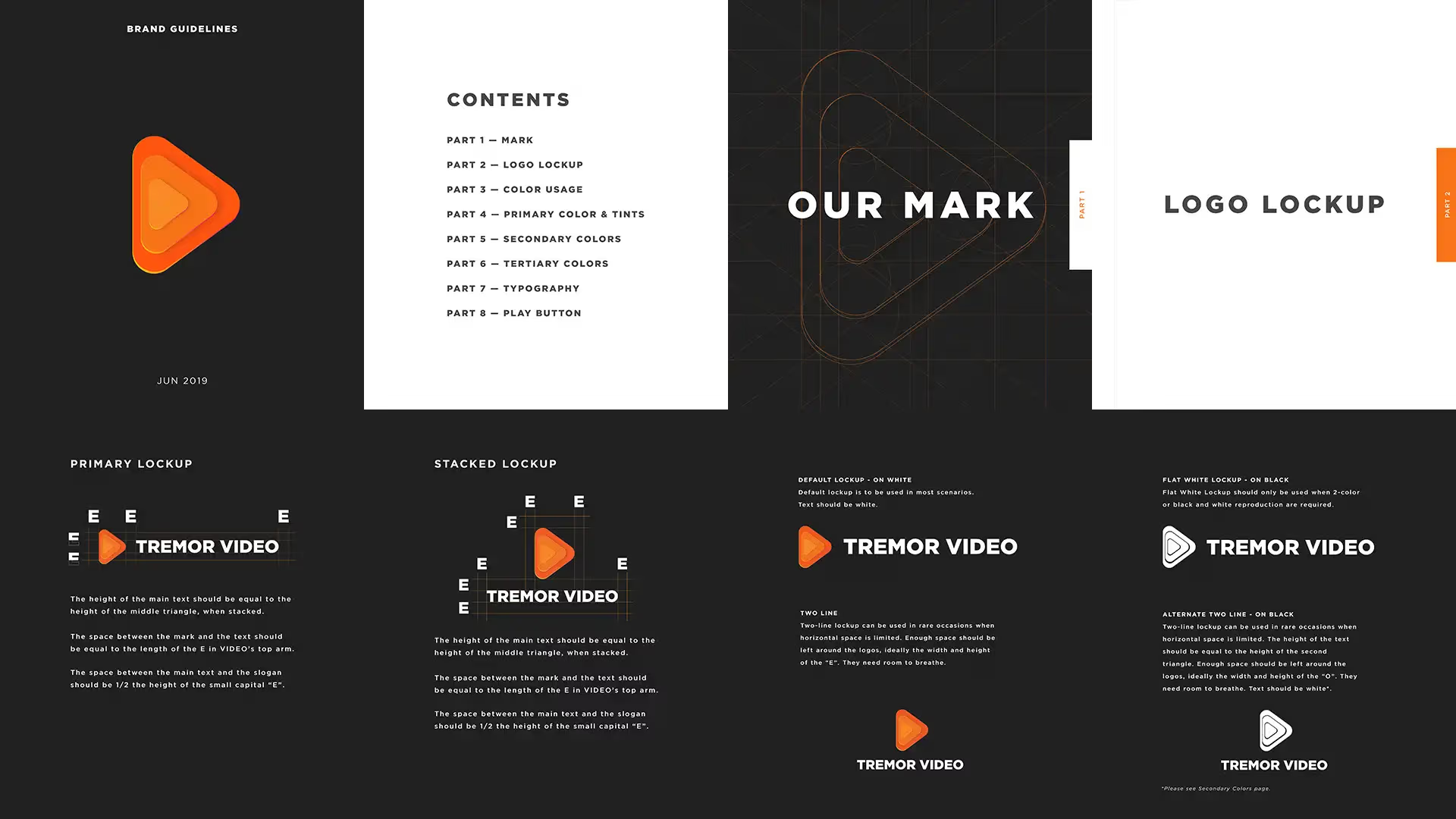
The goal of this project was to design a new brand identity for Tremor
Video; one that could also be used as a stand-alone mark, conveying their entertaining and
multifaceted video ad solutions.
When I was asked to rebrand Tremor Video, I was presented with an exhaustive list of visual
requests.
I had to convince them that they should focus on a “big idea” that would communicate what they do
with one simple image. Two questions came to mind:
I found balance between literal and abstract, dividing the given parameters into two groups: Design
Conventions and Abstract Concepts.
Design Conventions include concepts that most people would recognize easily such as mobile/desktop
video, television or other iconography that would be associated with these ideas.
Abstract Concepts include an approach to layers or levels that represent the different services
Tremor offers in the marketplace, flexibility for creative solutions, multiple-screens and also to
drive the idea of fun and approachability.
The clean lines, multi-layered levels, and simple beauty of the rice terraces led me to the
solution: Deconstruct and isolate the ideas of what the parameters were, but at the same time
eliminate some concepts that were unnecessary or redundant. In the end, I was able to push through
the noise to the core concept, delivering a simple design that spoke volumes.