Call of Duty. One of the most successful video game franchises in the world. I was fortunate enough
to get the opportunity to help launch some of these titles while also working on other amazing
projects such as the Call of Duty League and Call of Duty Endowment.
The amount of assets that we've built is something I don't think I could count: From platforms like
XboX, Playstation, and BattleNet, to in-game content.

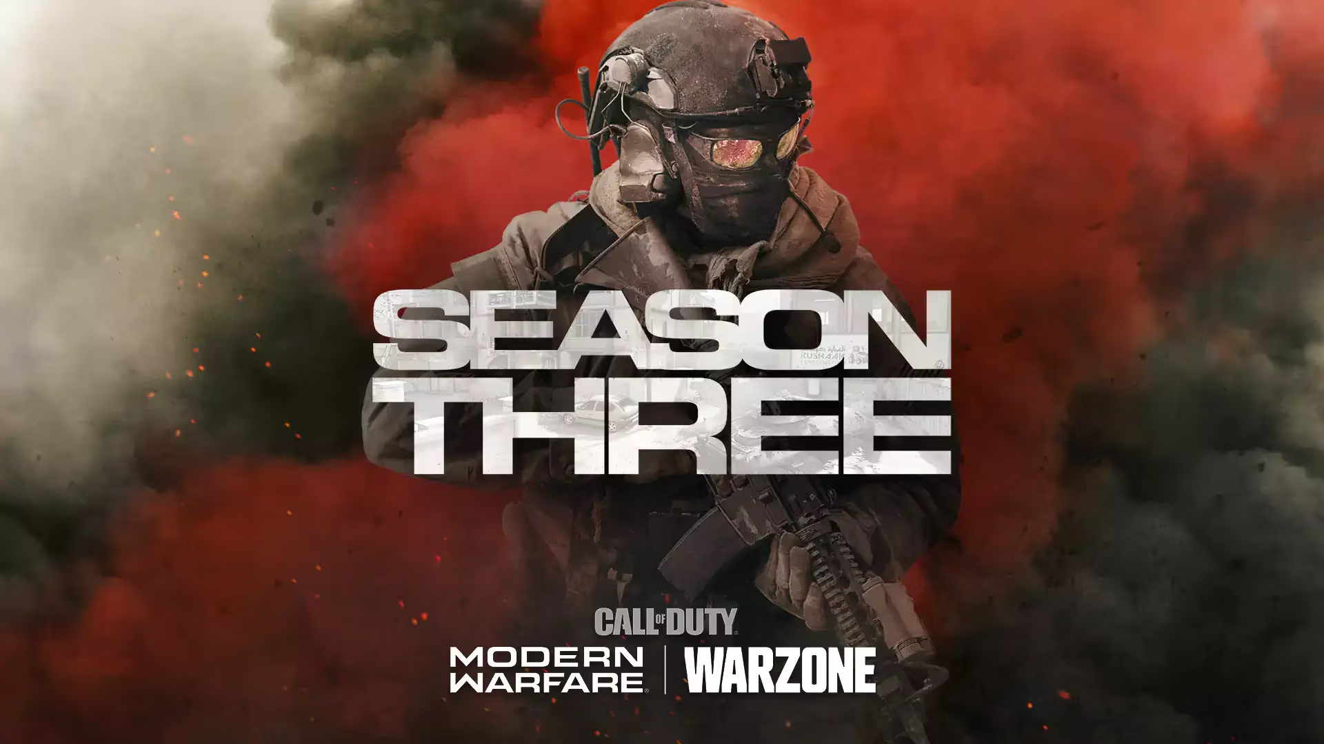
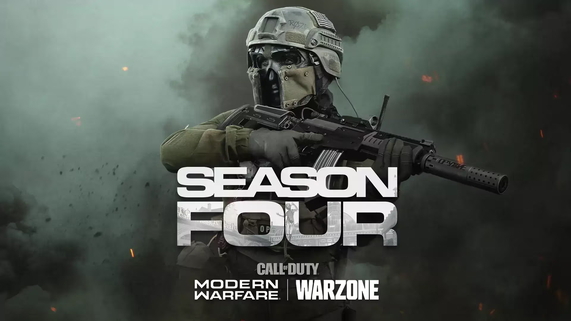
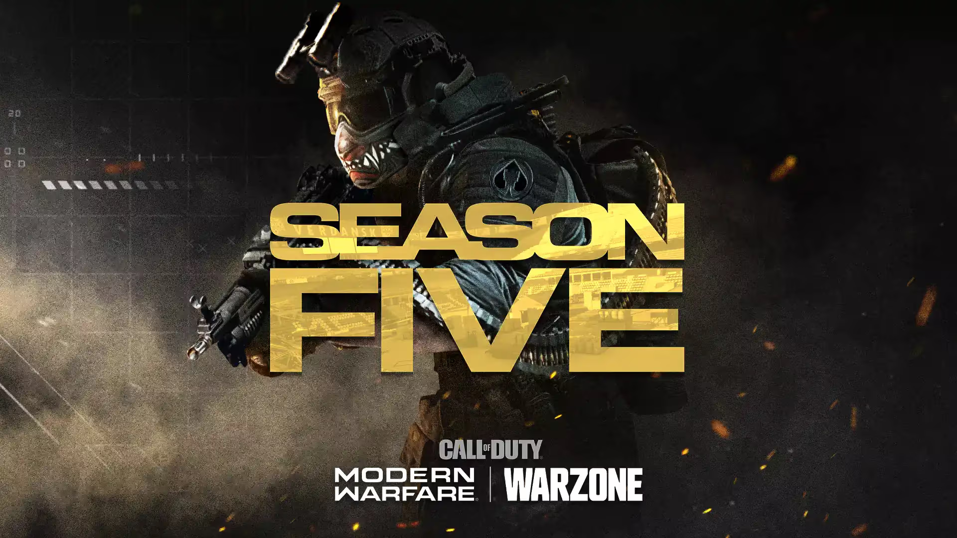
I set out to elevate the launch key art, produced by an outside agency, and bring it
back in-house. Inspired by the hours of work that had already been invested by
my colleagues, I hit the ground running with a specific destination in mind: Expansion.
The goal of this project was to devise a visual language that was consistent and
recognizable,
and that would also evolve with every season. We needed to showcase each operator and give every
season a unique feel and color palette based on the hero or anti-hero’s backstory.
Historically, the challenge has always been that all main assets are developed by
an outside agency
so we had to forge trust between my team and the stakeholders. This was a tall order since Call of
Duty is Activision’s largest, and most lucrative franchise.
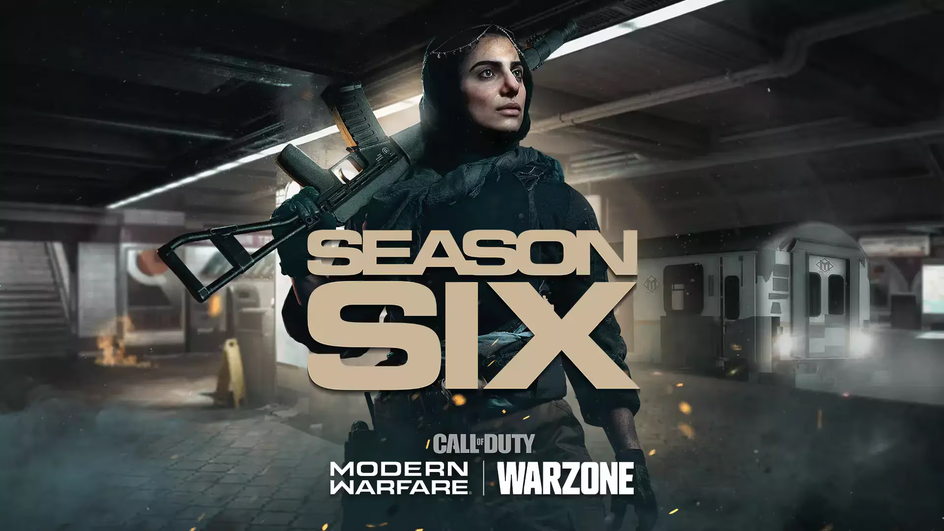
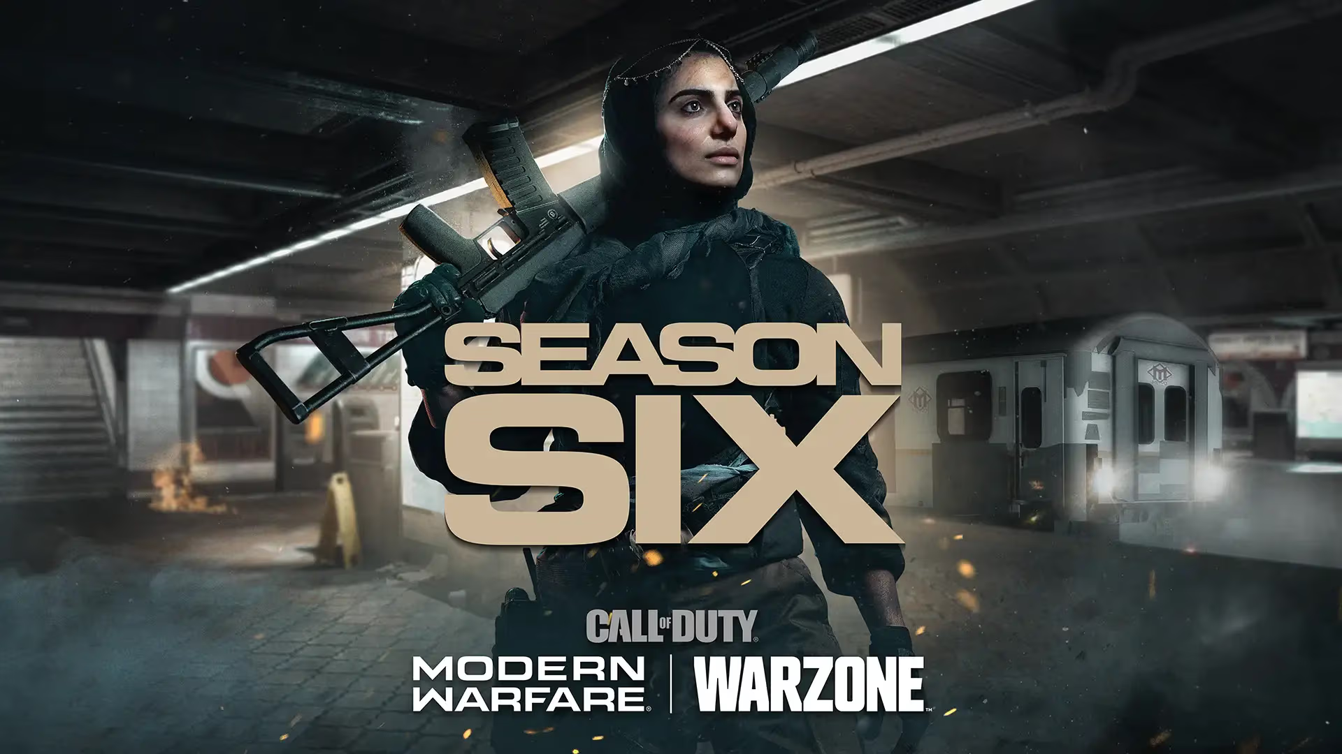
In Season Six, we introduced “Fast Travel” to Modern Warfare. It brilliantly uses the subway system
as the mechanic vehicle. When the idea was introduced and we were asked to actualize the key
art, the mechanic was still in development and wasn’t all the way fleshed out. We requested shots
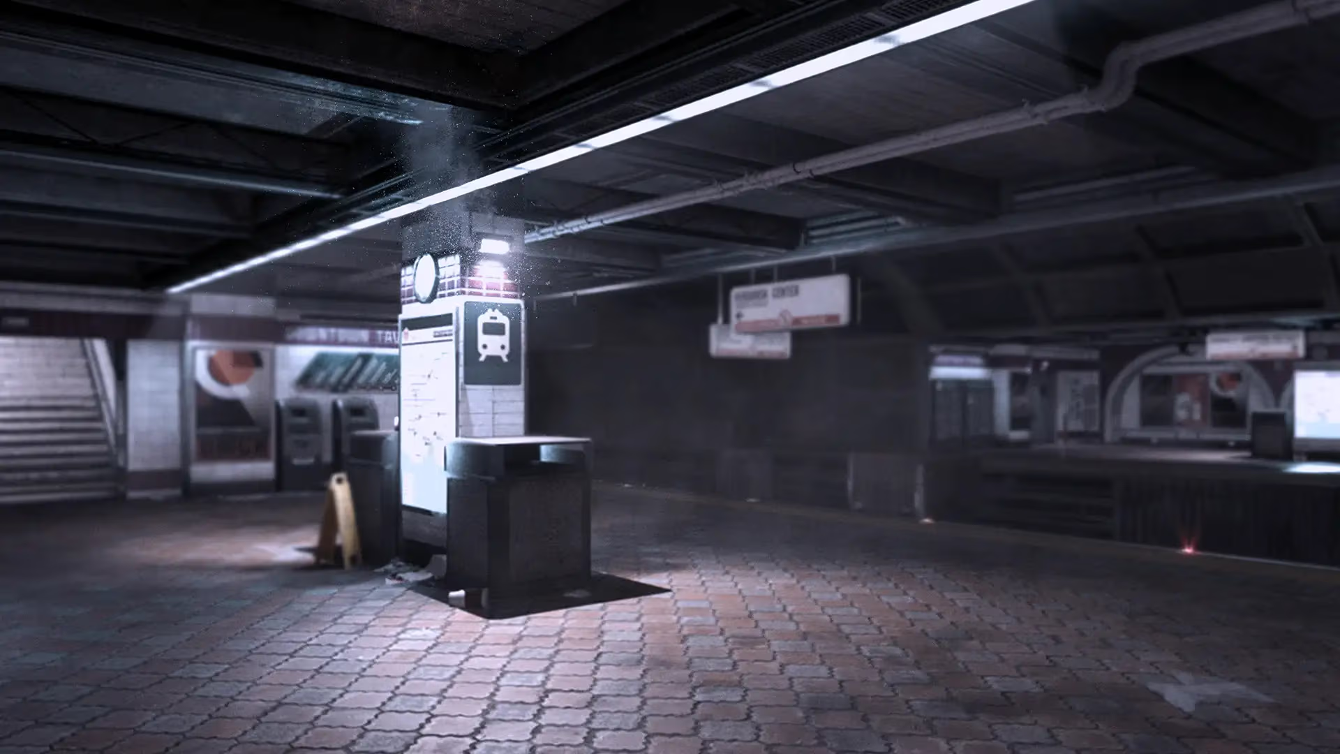
from our Capture department of the current train stations
that were available to them in the current game build. We also asked our photography agency to
provide
images of our new operator, "Farah”. My team and I used the body of Farah’s double, in addition to a
pre-game launch face image of Claudia Doumit (who plays Farah), to achieve the right look. We also
requested the in-game train 3D model to texture and render.
Team:
Oscar de Leon-Sulecio, Marketing Art Director/Creative Lead, Design | Graydon Driver, Marketing
Senior Designer
| Jared Castle,
Marketing
Manager | Edgar Gamez, Marketing Manager | Joel Emslie, Studio Art Director | Ivan Gamez, Producer |
Quinn Peddelton, Account Coordinator | Mike Martinez, Account Coordinator.
Below is the evolution of the Call of Duty: Modern Warfare Season Six key art, from the initial
background image to the finished product.
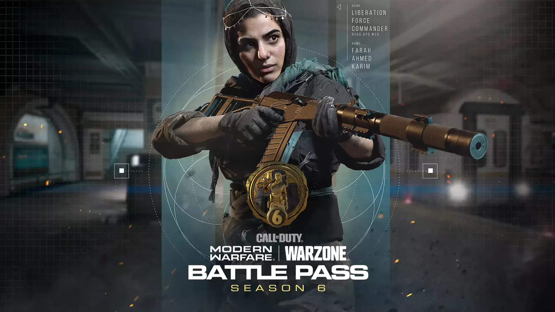
I mentored an Associate designer through brainstorming, research, and concept to achieve one of the
best Battle Pass key art for MW 2019. We used a different angle from the seasonal key art and
created a look based on the operator's backstory.
Team: Oscar de Leon-Sulecio, Marketing Art Director/Creative Lead, Design |
Graydon Driver,
Marketing Senior
Designer |
Anne Yost, Marketing Associate Designer.
The Call of Duty digital marketing team is always searching for new ways to keep gamers updated with
fresh content. Warzone has a considerable number of fans and it is always a challenge to keep
players hooked and in-the-know. They release new videos, post regular updates on social media, and
also use various other forms of content to keep fans engaged, including:
One of our goals was to surprise the community with the return of this memorable
map while also showcasing our incentives. Our team was aiming to quickly show why Nuketown looks
different now through high-octane action and creative storytelling.
Nuketown was a nuclear test site, and we needed to establish the past three decades from the get-go.
From a design perspective, our biggest challenge was clearly showing the connection
between the 50’s
and the 80’s without much exposition.
We decided to go with a very literal approach by having a party invitation
handwritten and
decorated using an old US Government warning flier.
Team: Oz de Leon, Marketing Art Director/Creative Lead, Design | Graydon Driver,
Marketing Senior Designer
| Henry Zurawski, Senior Designer | Tom Flynn, Associate Creative Director, Video | Roman France,
Capture Lead | Spencer King, Motion Graphics Lead | Trevor Bresaw, Associate Creative Director Audio
| Quinn Peddelton, Account Coordinator | Mike Martinez, Account Coordinator.
When the Call of Duty: Cold War Violet Tracer pack landed on our desks, the pressure was on. Our
only creative ammo? The weapons themselves. We noticed the blueprints sported some seriously cool
decals. The challenge became clear: reverse engineer those decals into an anime-style key art that
looked like it birthed the weapon designs.
Team: Oz de Leon, Marketing Art Director/Creative Lead, Design | Henry Zurawski,
Senior Designer | Quinn Peddelton, Account Coordinator | Mike Martinez, Account Coordinator.
Call of Duty: Modern Warfare's Season Four Battle Pass brought legendary warfare to your fingertips.
Tier progression unlocked the iconic Captain Price, a fan-favorite operator returning to the fray.
But Price wasn't alone. The pass boasted a stockpile of fresh weapons, unique weapon blueprints, and
cosmetic goodies, making it a content drop no Call of Duty enthusiast could resist.
Team: Oz de Leon, Marketing Art Director/Creative Lead, Design | Graydon Driver,
Marketing Senior Designer | Quinn Peddelton, Account Coordinator | Mike Martinez, Account
Coordinator.
The goal for the Call of Duty: Modern Warfare Anime Super tracer pack was, above all, authenticity.
We wanted to create a piece of anime key art that transcended mere marketing. It had to seem as if
it inspired the pack itself, not the other way around.
Team: Oz de Leon, Marketing Art Director/Creative Lead, Design | Henry Zurawski,
Senior Designer | Quinn Peddelton, Account Coordinator | Mike Martinez, Account Coordinator.
Call of Duty: Black Ops Cold War's Season Five Reloaded roadmap wasn't just about new content, it
was about fulfilling promises. The roadmap teased the arrival of features hinted at in the initial
Season Five reveal, like the exciting Double Agent game mode. It also unveiled new maps, bundles
featuring established action heroes, and a fresh injection of weapons to the Cold War arsenal. This
update aimed to keep players engaged and the battlefield dynamic until the next full season kicked
off.
Team: Oz de Leon, Marketing Art Director/Creative Lead, Design | Graydon Driver,
Marketing Senior Designer | Quinn Peddelton, Account Coordinator | Mike Martinez, Account
Coordinator.
Mayhem, a miniature model of a city in the style of a 1950s monster movie, was released in 2022 as
part of the Call of Duty: Vanguard game. It was well-received by critics and fans alike, who praised
its look and feel, as well as its fun and chaotic gameplay. The video, which was in black and white,
was a great way to promote the new map, as it showed off its unique aesthetic. The video was also
unveiled to coincide with the release of the Godzilla and King Kong crossover.
Team:
Oz de Leon, Marketing Art Director/Creative Lead, Design | Oz DeLeon, Writer | Brooke Honkonen,
Video Editor | Quinn Peddelton,
Account Coordinator | Mike Martinez, Account Coordinator.
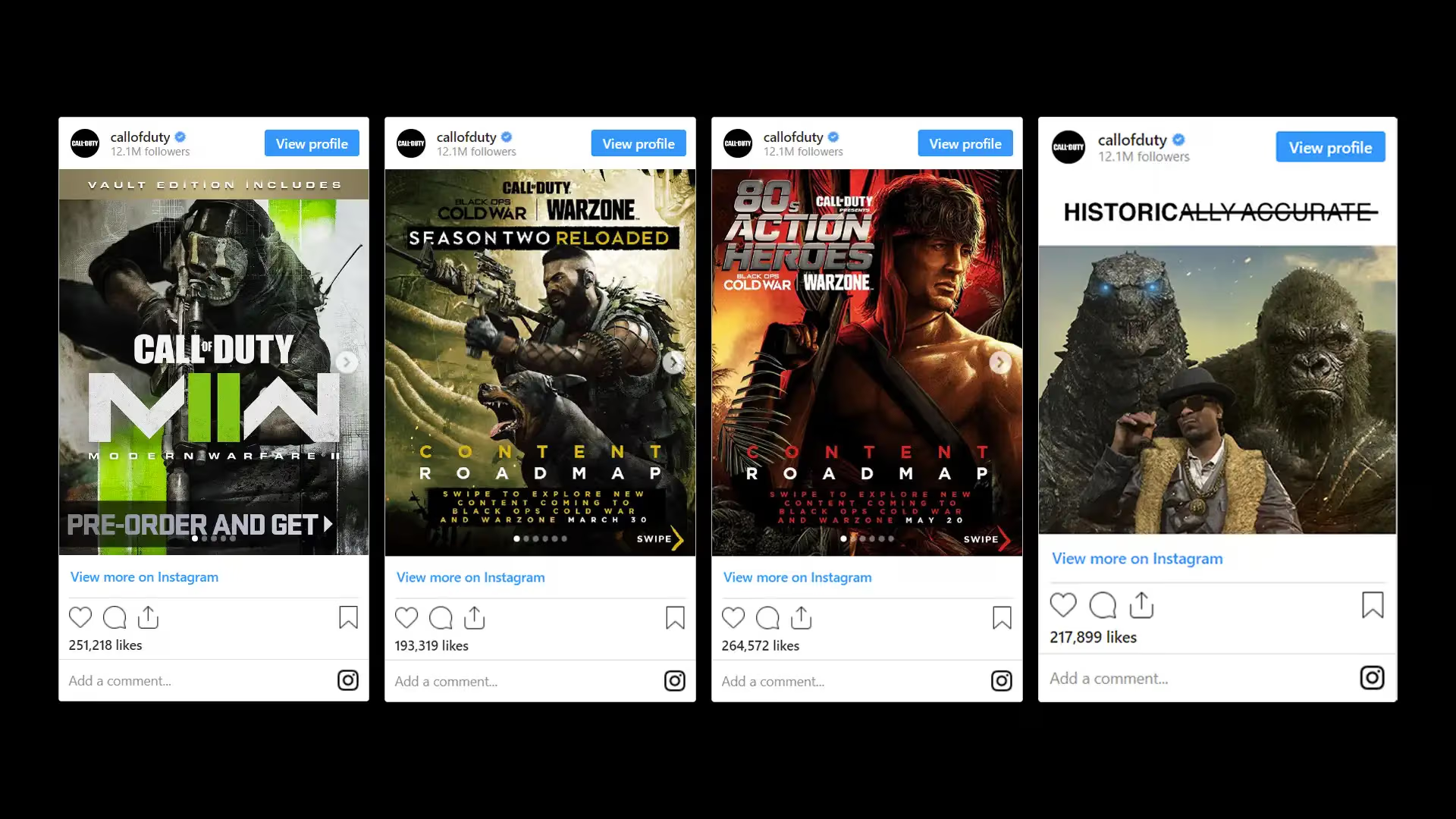
I was responsible for the overall art direction of the carousels, as well as the creative direction
of the images and videos. I worked closely with a team of visual designers and GFX artists to create
engaging carousels that would appeal to our target audience.
Team:
Oz de Leon, Marketing Art Director/Creative Lead, Design | Paarth Trivedi, Social Marketing | Visual
Design Team | Game Capture Team
| Ashley Deleon, Producer.
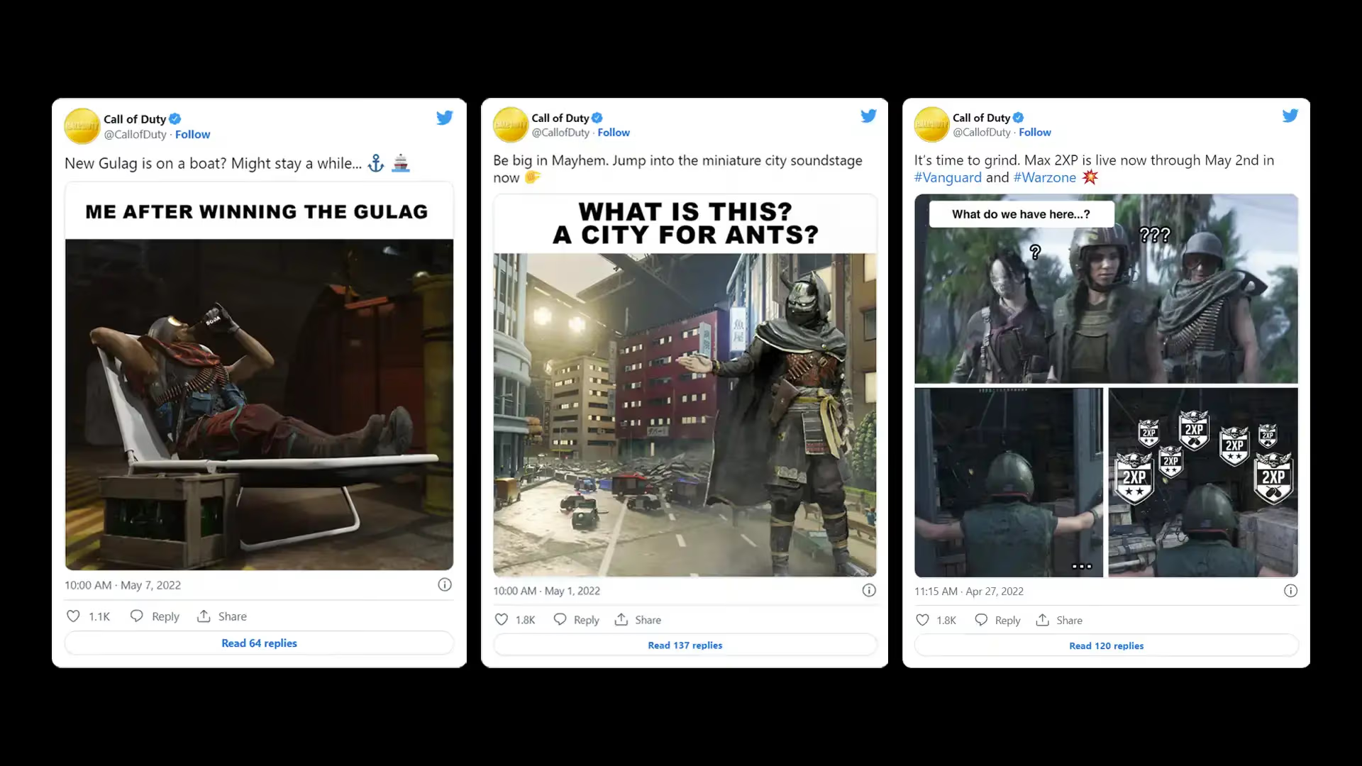
The social marketing department and I worked together to write and create memes for Call of Duty
campaigns. We brainstormed ideas for memes that would be funny and relatable to our fans. We were
very happy with the results of the campaign, and we were eager to continue using memes in our future
marketing efforts.
Team:
Oz de Leon, Marketing Art Director/Creative Lead, Design | Paarth Trivedi, Social Marketing | Visual
Design Team | Game Capture Team
| Ashley Deleon, Producer.
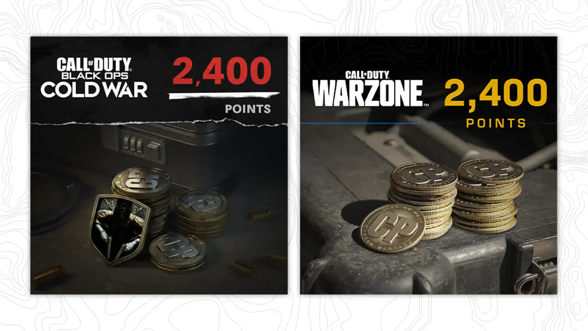
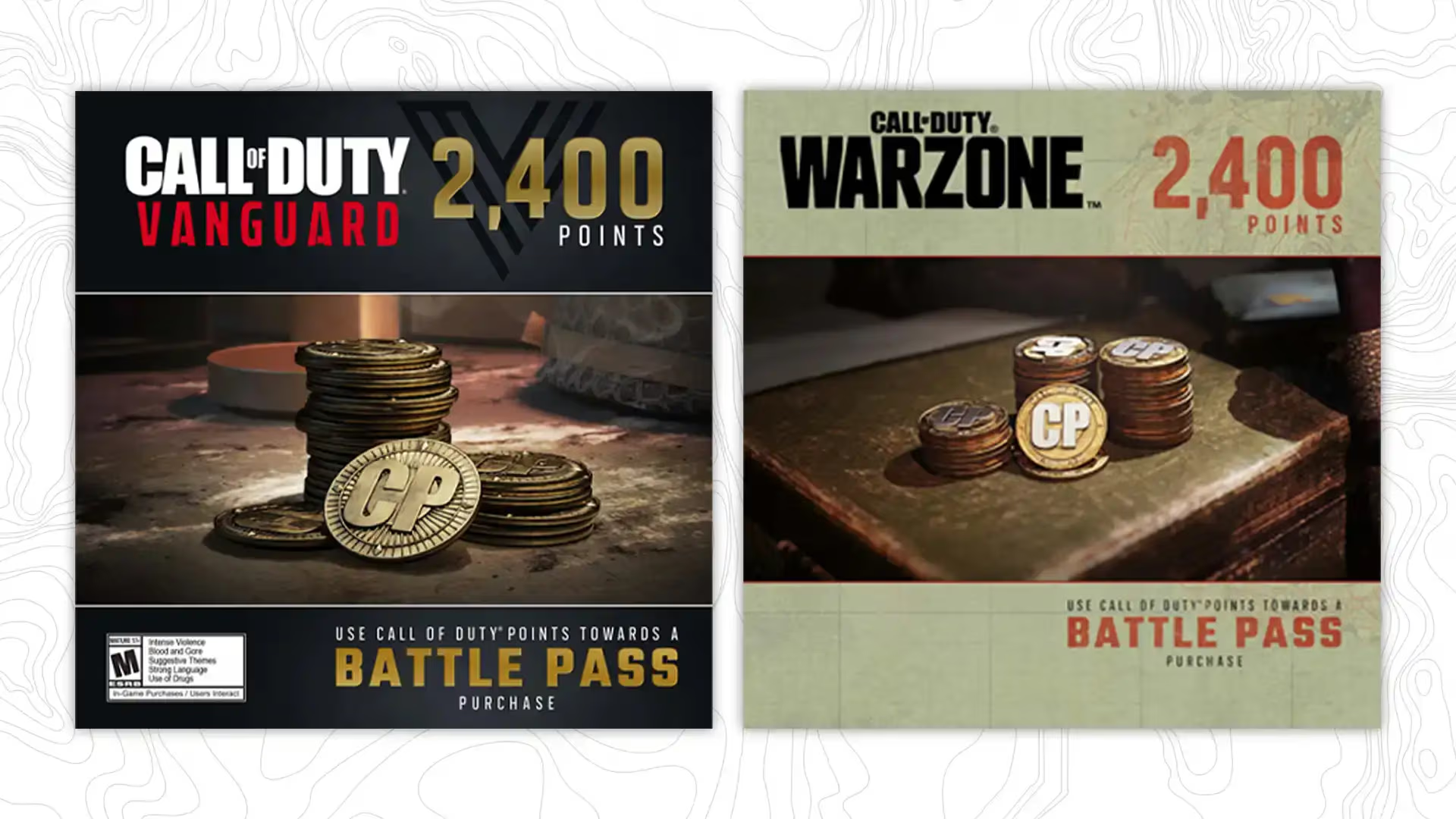
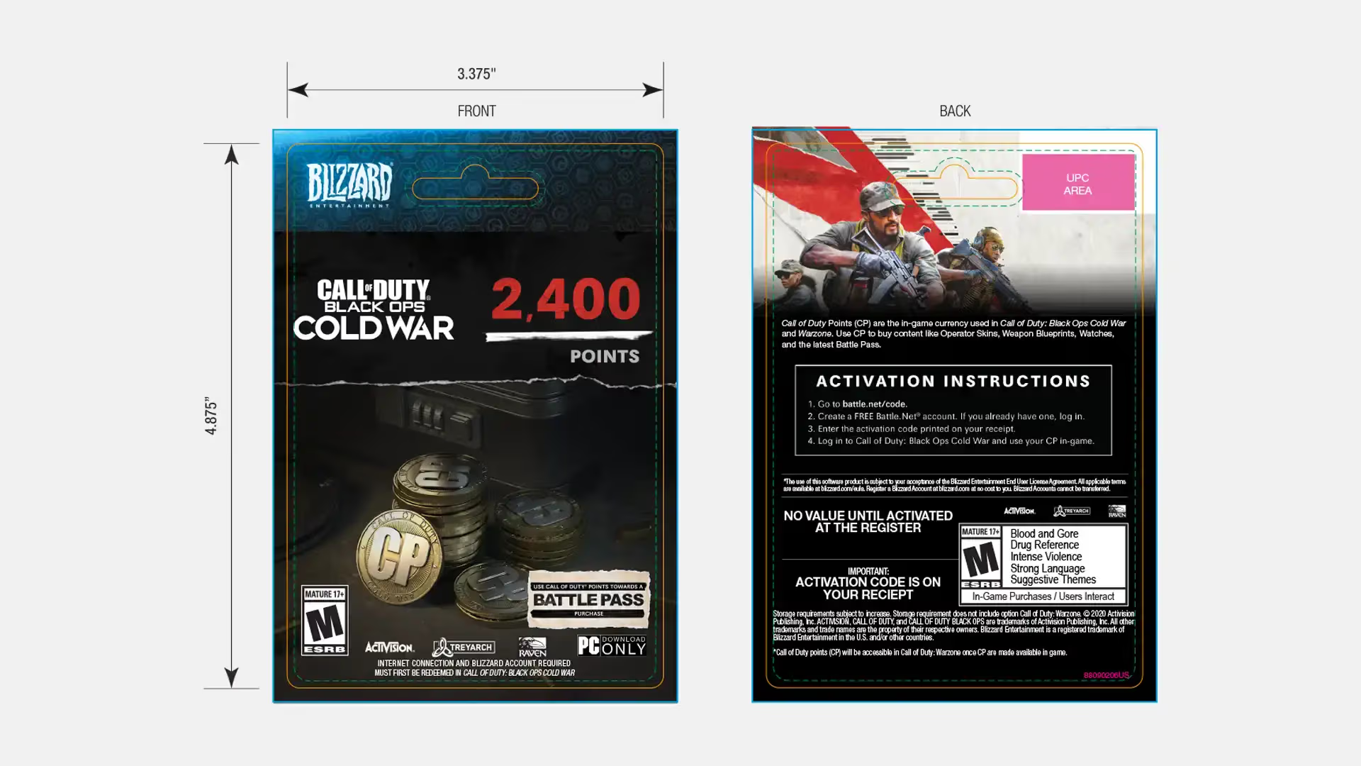
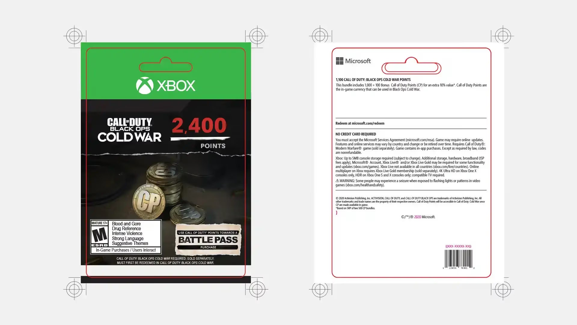
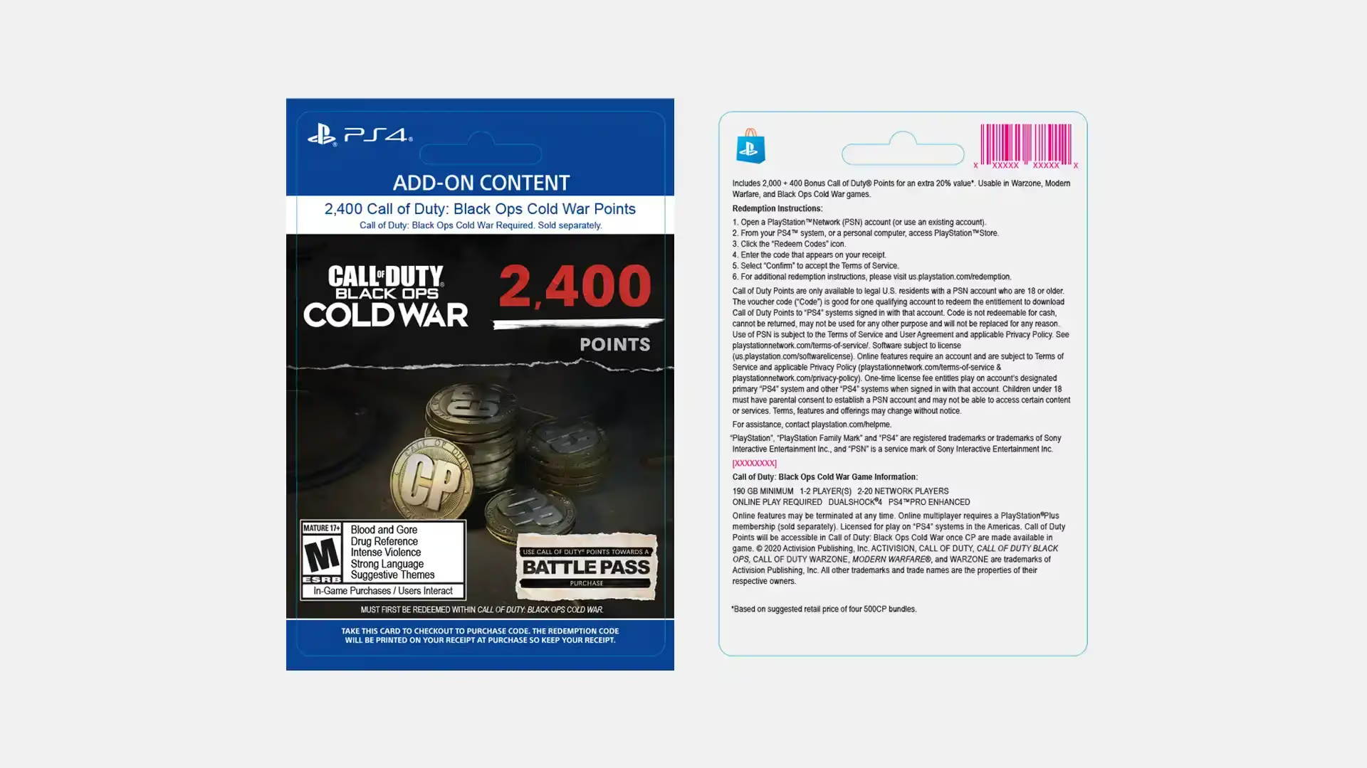
In Call of Duty titles, Call of Duty Points (CP) function as the virtual currency. Players can
utilize CP to acquire various cosmetic and functional in-game content, including Battle Passes for
tiered rewards, unique weapon blueprints, personalized operator skins, and distinctive calling cards
and emblems.
I designed the look and feel of the physical and digital Call of Duty Points cards, and my team
created and produced the print-ready versions for our vendors and partners.
Team: Oscar de Leon-Sulecio, Creative Lead, Design | In-House Design Team.
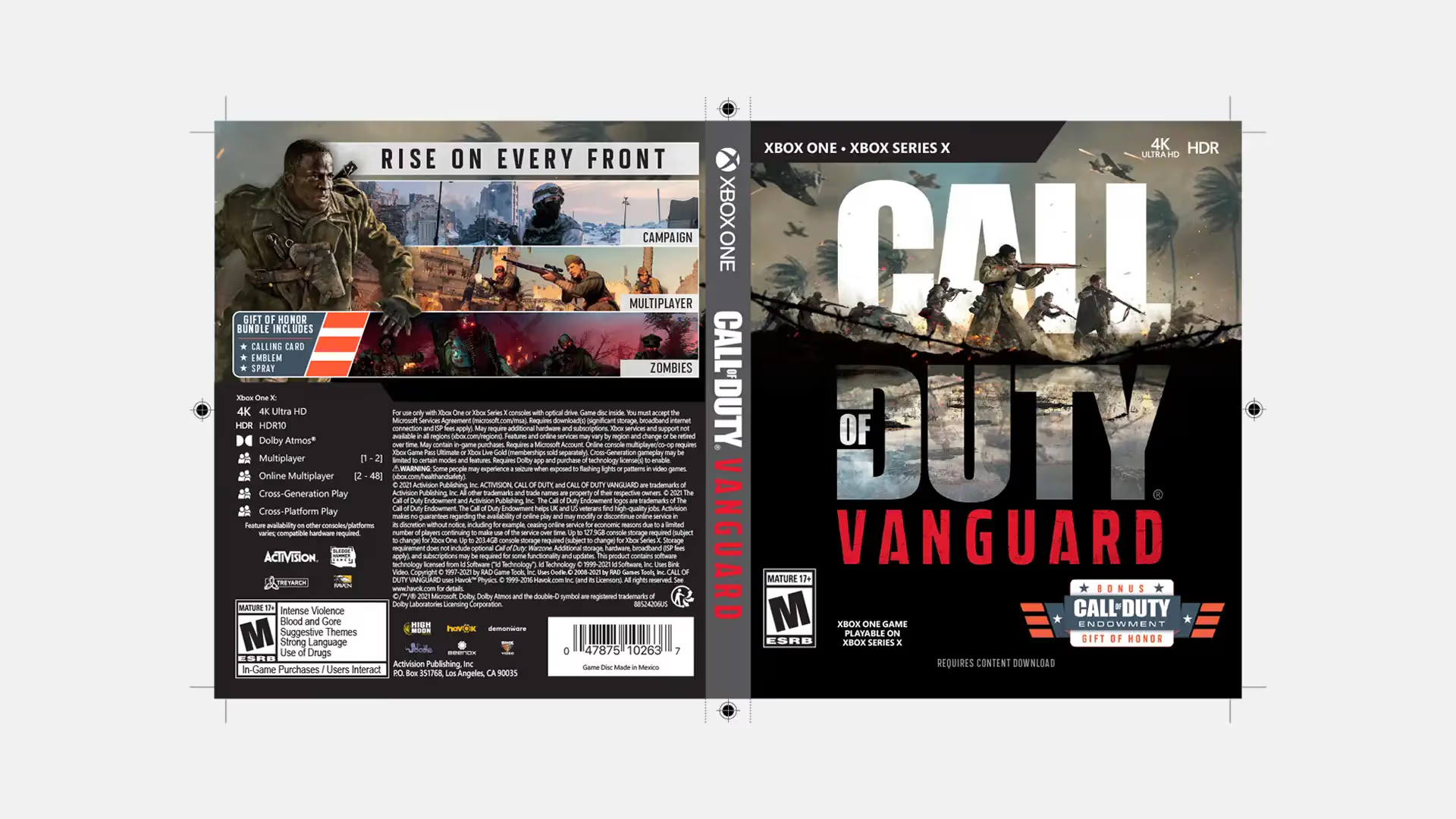
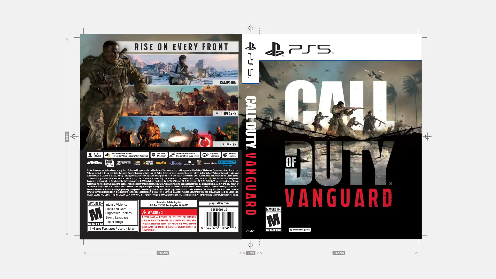
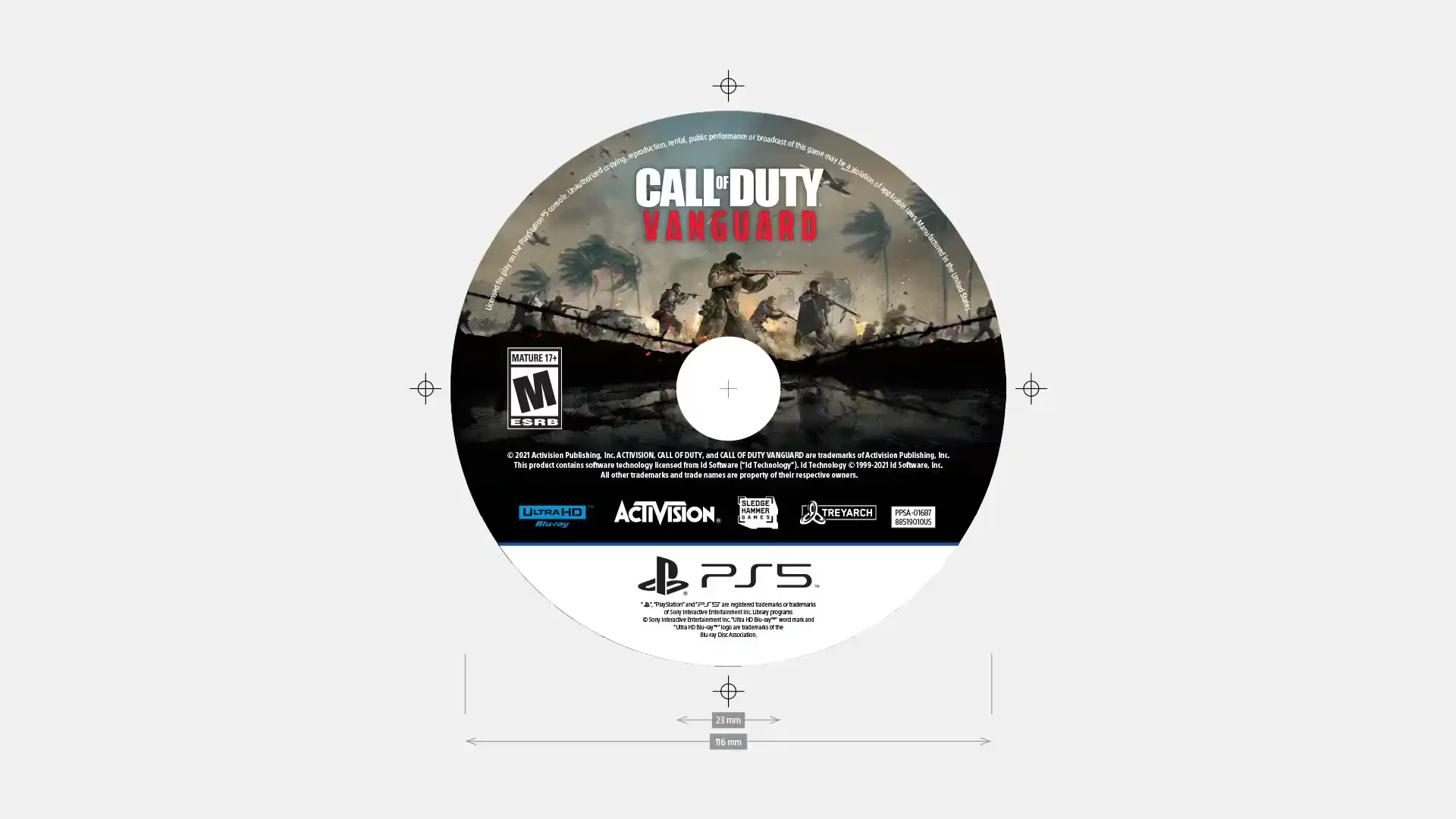
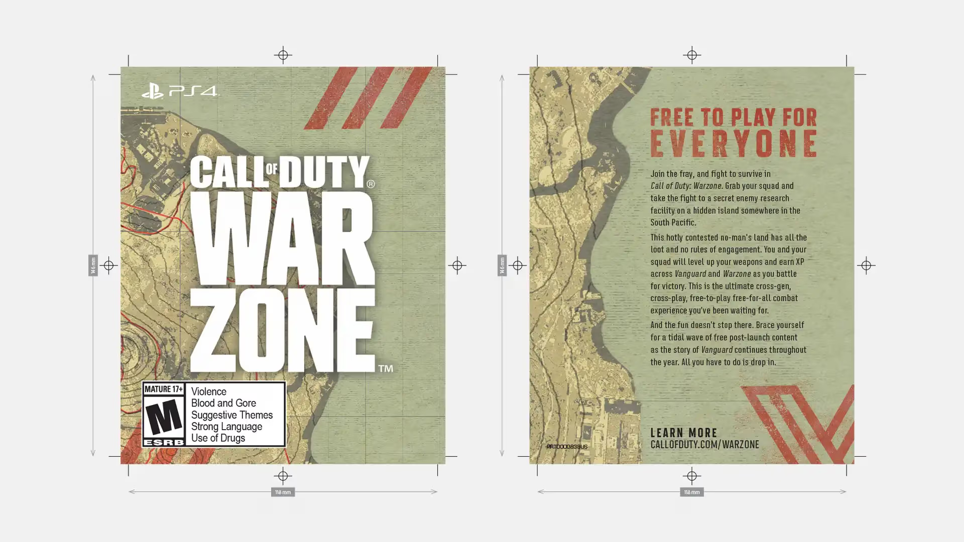
My team designed and produced the game box, disc, and insert, including all of the artwork and
print-ready files. We worked closely with our print vendors to ensure that the final products met
our high standards for quality and accuracy.
Team: Oscar de Leon-Sulecio, Creative Lead, Design | In-House Design Team.
