How I navigated dozens of visuals to create a single logo.
I set out to create a mark that could be used on its own while also devising the company’s new brand
guidelines.
The goal of this project was to design a new brand identity for Tremor
Video; one that could also be used as a stand-alone mark, conveying their entertaining and
multifaceted video ad solutions.
When I was asked to rebrand Tremor Video, I was presented with an exhaustive list of visual
requests.
I had to convince them that they should focus on a “big idea” that would communicate what they do
with one simple image. Two questions came to mind:
- What type of image would we get if we fused the words “Tremor” and “Video”?
- What instinctively pops into my mind when I hear the word “Tremor”?
Parameters were introduced from the stakeholders, mostly to emphasize concepts like video, all-screens, and media cohesion.
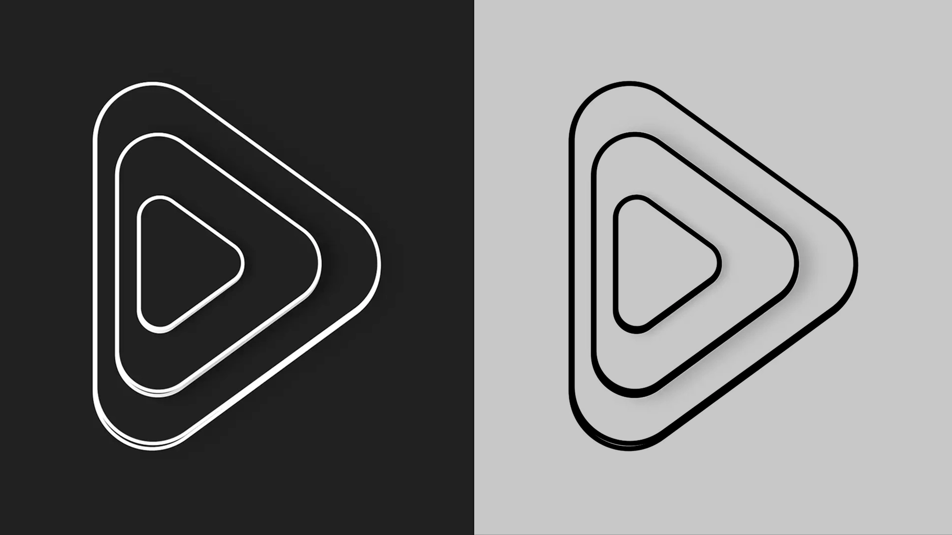
Working from this point and calling back to the initial two challenge questions, I landed on a simple idea: Ripples. Immediately, a powerful image stood out to me: The rice terraces in Muong Hoa Valley, Vietnam.
Team: Oscar de Leon-Sulecio, Creative Direction and Design | Les Seifer, Head of creative | Jesse Fink, Director of creative strategy.
I found balance between literal and abstract, dividing the given parameters into two groups: Design
Conventions and Abstract Concepts.
Design Conventions include concepts that most people would recognize easily such as mobile/desktop
video, television or other iconography that would be associated with these ideas.
Abstract Concepts include an approach to layers or levels that represent the different services
Tremor offers in the marketplace, flexibility for creative solutions, multiple-screens and also to
drive the idea of fun and approachability.
The clean lines, multi-layered levels, and simple beauty of the rice terraces led me to the
solution: Deconstruct and isolate the ideas of what the parameters were, but at the same time
eliminate some concepts that were unnecessary or redundant. In the end, I was able to push through
the noise to the core concept, delivering a simple design that spoke volumes.


Double Agent multiplayer mode
Call of Duty: Double Agent multiplayer mode is a social deduction game mode that was added to Call of
Duty: Black Ops Cold War in Season Five. In this mode, players are divided into two teams:
Operatives and Double Agents. The Operatives must either eliminate all Double Agents or complete
certain objectives to win the round, while the Double Agents must either eliminate all Operatives or
sabotage the objectives to win the round.
Our creative team was tasked by Consumer Marketing to redesign the in-game Double Agent logo for use
in marketing materials. The redesigned logo had to meet several key requirements: It had to be
dynamic, convey duality, and align with the current season's overall look and feel.
Team: Oscar de Leon-Sulecio, Creative Direction and Design | Kellen Laker,
Associate Director, Marketing.
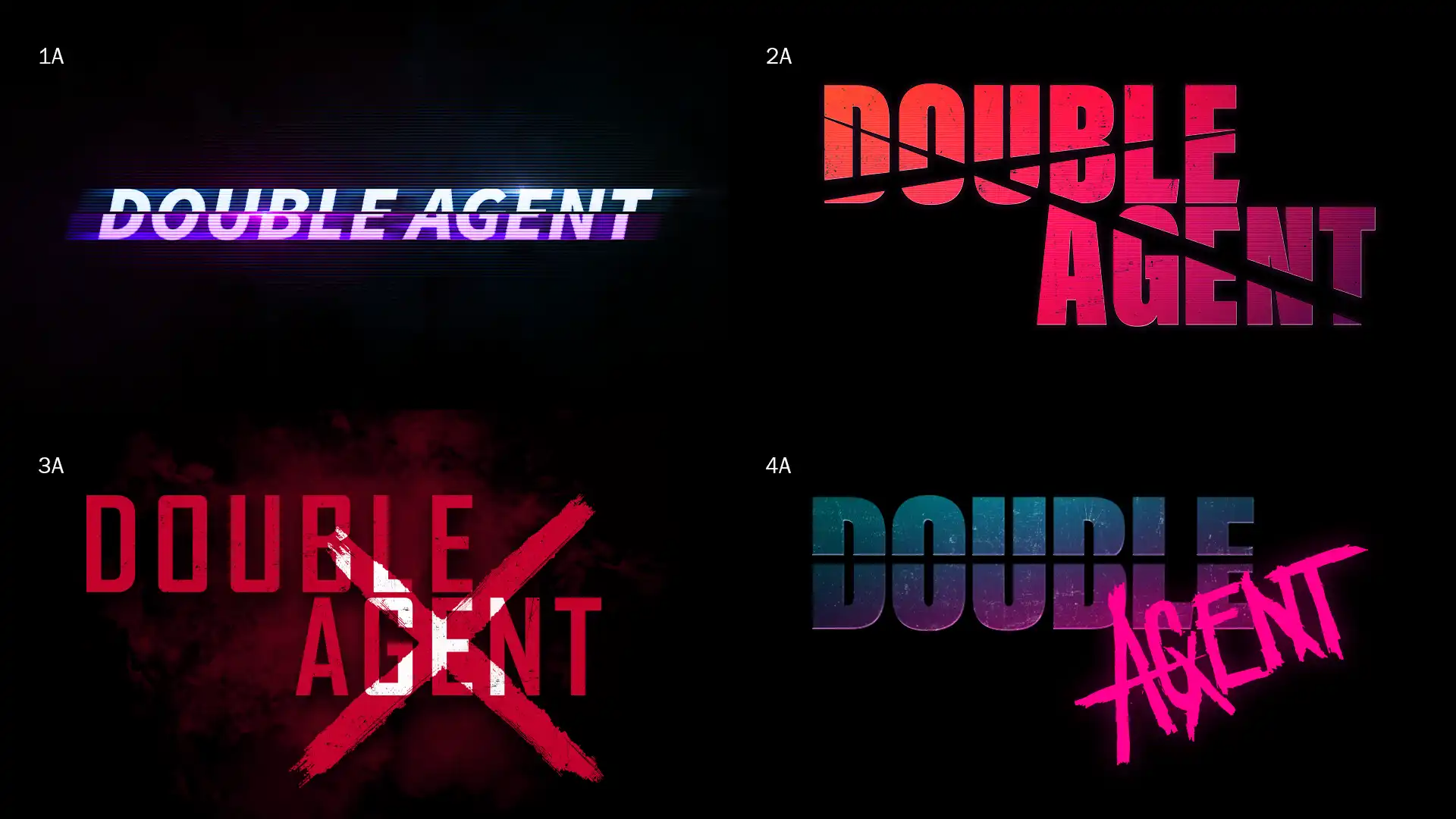
See the new Double Agent logo in the multiplayer mode reveal trailer below.
Post, post mortem.
A week before I left Activision, I had the amazing opportunity to work on the Call of Duty: Next
logo. At the time, I didn’t know how big the event was going to be or what they were going to
announce. (Read What is Call of Duty: Next below.)
For full transparency, I did not finish the logo, but created multiple concepts for our marketing
department. To my surprise, they built upon one of my designs, and did an amazing job with the
updates. I’m just glad I had a small part in helping develop the logo.
I got to experience the event as both an outside creative and a fan, which was super exciting.
What is Call of Duty: Next?
I had a few goals here:
- Win the design bake off between us (the internal design team), and an external agency.
- Design a logo that easily conveys the messaging.
- Keep the look consistent with the brand.
Working on something that is veiled behind a lot of secrecy was a challenge, but what is harder is when you don’t know what the secret is either.
Our approach was to first define what "next" means.
Next
/nekst/
Adjective
1. Coming immediately after the time of writing or speaking.
2. Coming immediately after the present one in order, rank, or space.
Adverb
1. On the first or soonest occasion after the present; immediately afterwards.
2. Following in the specified order.
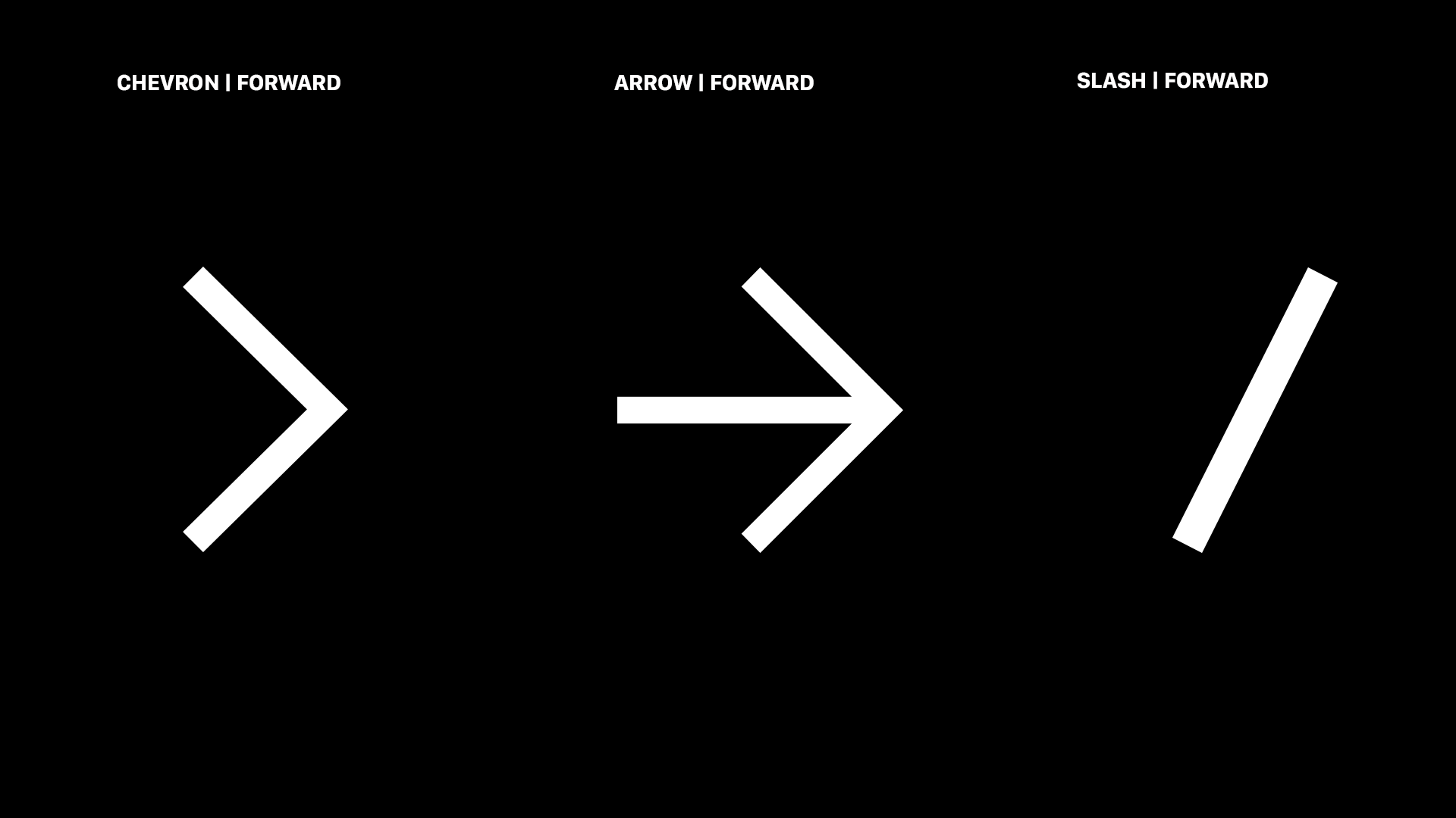
The graphical approach was to use signifiers and conventions conveying forward
movement.
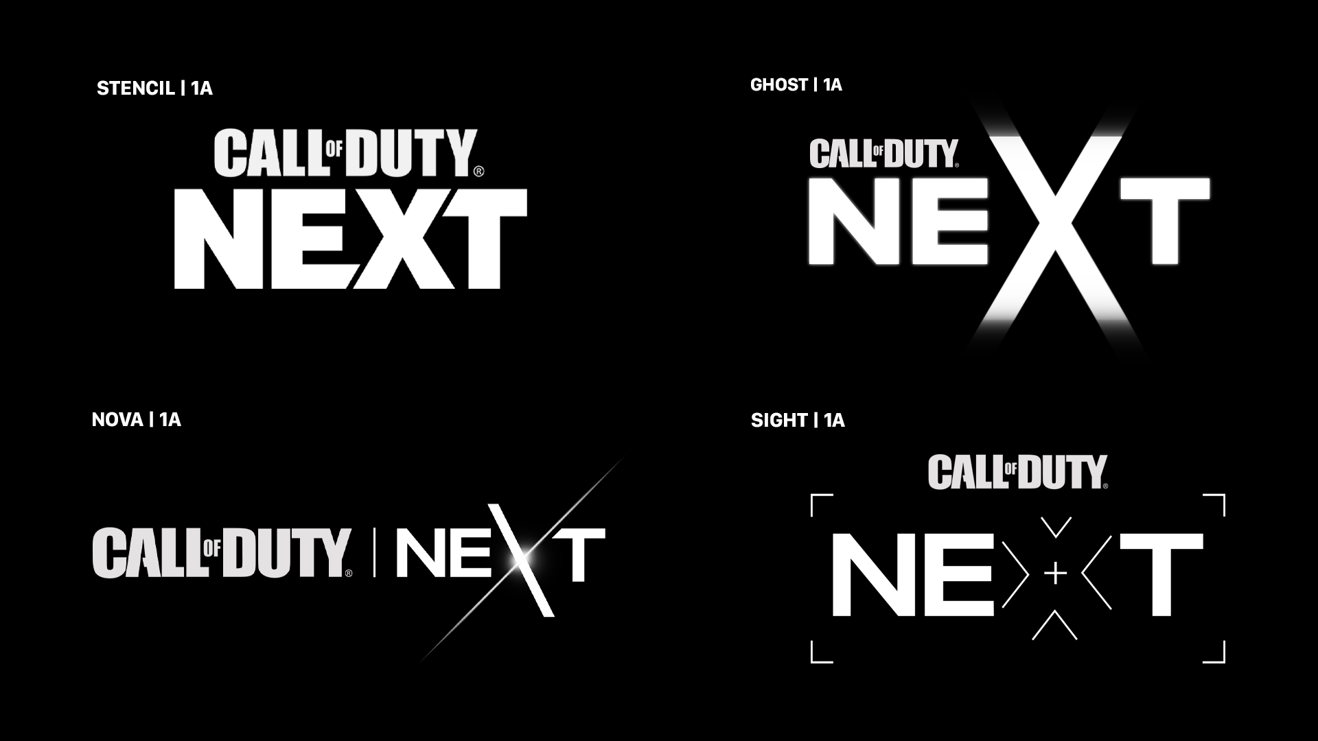
These are the two logos that made it to the final round.

What if?
What if I had the chance to polish the logo?
I love what they did with it, but there are certainly some quirks and inconsistencies.
As Dewey Finn would say, "That was awesome. You rock, but it’s a little sloppy joe. You need to
tighten up the screws."
To the protractor!
To keep true to the initial concept of moving forward, I decided to keep the forward slash. I wanted
to use the slash to create a subtle visual of the forward slash breaking through the backslash. I
also added the angle cuts from the Activision version, but I decided to use a consistent angle based
on the backslash. I removed all the odd round corners on the “N” and “E” of the official logo and
added consistent subtle roundness across the board leaving the new “X” sharp to match the MWII logo
aesthetic.
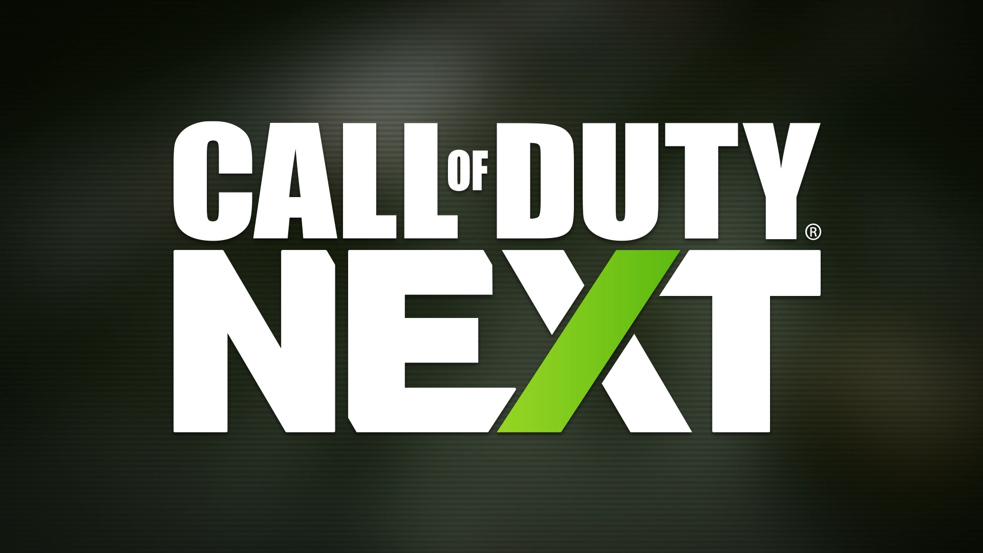
Below you can find a comparison of both logos. On the left is the official logo by
Activision, and on the right is my revision.

Final thoughts
The Call of Duty: Next event was incredible and I’m sure the teams at Activision
worked tirelessly,
and passionately, to make the event the success that it was. I can say for certain that I enjoyed it
very much. This “What if?” project was a fun exercise inspired by their great work.
Call of Duty Endowment Logo Update
The direction was clear. I needed to keep the colors and graphical elements. I started by
identifying alignment and padding issues. After tightening the angles and other scale quirks, I
started creating the logo suite which is now being used across all Call of Duty properties.
Below is a side-by-side comparison of the previous logo (left) and the
updated logo I designed (right).
Team: Oscar de Leon-Sulecio, Marketing Art Director/Creative Lead, Design.

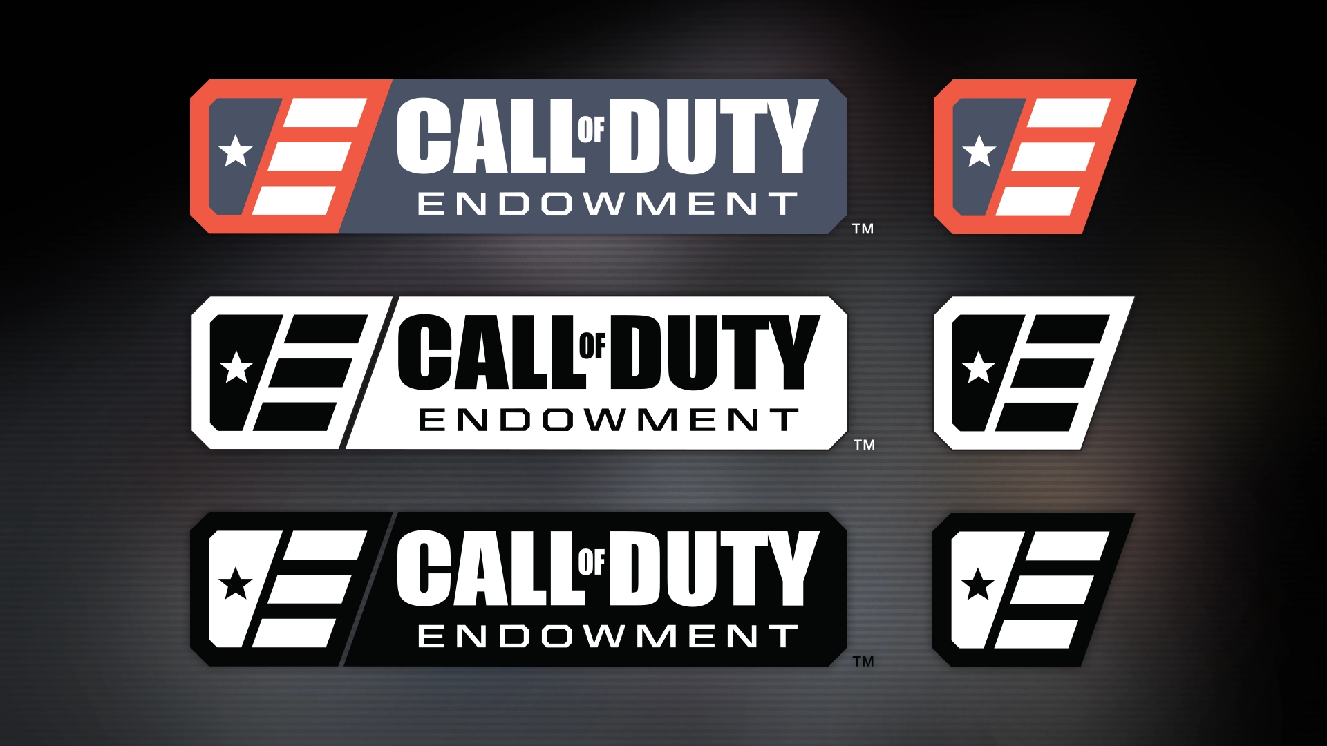
The following logo suite includes both negative and positive versions.
